Web Design Sheffield
The Role of Responsive Design in Sheffield’s Mobile Market
Sheffield, known for its rich industrial heritage and thriving cultural scene, is also a city that’s rapidly embracing the digital age. With an increasing number of people relying on their mobile devices to access the internet, the importance of having a mobile-friendly website cannot be overstated. In Sheffield, where local businesses are a cornerstone of the community, ensuring your website is accessible and user-friendly on all devices is essential. This is where responsive design plays a crucial role.
The Growing Demand for Mobile-Friendly Websites in Sheffield
Mobile internet usage in Sheffield has seen a significant surge over the past few years. Whether locals are searching for information about events at the Crucible Theatre or looking for the best places to eat around Kelham Island, their first point of contact is often their smartphone. For businesses in Sheffield, this trend highlights the necessity of having a website that performs well on mobile devices.
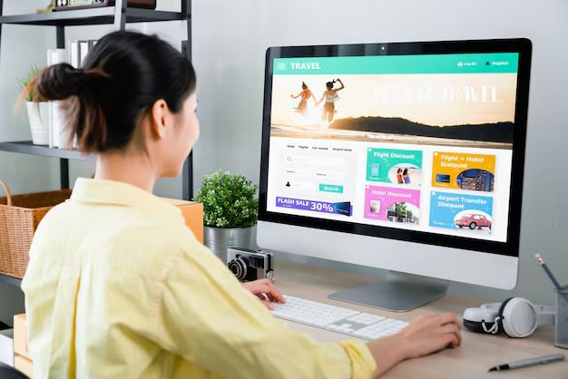
Responsive design is not just a buzzword; it’s a fundamental requirement for any business looking to succeed online. As more Sheffielders shop, research, and engage with brands via their mobiles, a responsive design ensures that your website looks and works well on any device, whether a smartphone, tablet, or desktop.
What is Responsive Design?
Responsive design refers to a web design approach that allows a website to adapt to the size and shape of the screen it’s being viewed on. This means that whether someone is browsing your website from a laptop at Sheffield Hallam University or on their phone while waiting for a tram at Sheffield Station, the experience remains seamless.
By employing responsive design, you ensure that images, text, and navigation elements adjust automatically to provide an optimal viewing experience. This approach not only enhances user satisfaction but also helps to reduce bounce rates, as visitors are less likely to leave a site that’s easy to navigate, regardless of the device they’re using.
The Impact of Responsive Design on Sheffield Businesses
For businesses in Sheffield, responsive design is more than just an aesthetic improvement; it’s a strategic advantage. Take, for example, the bustling Sheffield City Centre, where shoppers and visitors frequently use their mobiles to find stores, restaurants, and services. A website that’s easy to navigate on a mobile device can significantly increase customer engagement and conversion rates.
Local businesses that have adopted responsive web design have seen noticeable improvements in their online presence. From increased traffic to better customer retention, the benefits are clear. Whether you run a café in the Devonshire Quarter or a boutique shop near Ecclesall Road, a responsive design can help you connect with customers on the go, ensuring they find what they need quickly and efficiently.
SEO Benefits of Responsive Design for Sheffield Businesses
In addition to improving user experience, responsive design offers substantial SEO benefits, particularly for businesses in Sheffield. Google’s algorithms favour mobile-friendly websites, which means that having a responsive design can boost your website’s ranking in search results. This is especially important for local SEO, as Sheffield businesses compete for visibility in a crowded market.
For instance, if you’re a business located in the Sharrow area, a responsive website can help you appear higher in search results when potential customers search for services in your vicinity. The combination of responsive design and targeted keywords, such as web design and web design in Sheffield, ensures that your site is not only user-friendly but also easy to find online.
In Sheffield’s increasingly mobile-driven market, having a responsive website is no longer optional—it’s a necessity. By ensuring that your website is easily accessible and navigable on any device, you can enhance customer engagement, improve your search engine rankings, and ultimately drive more business. For local businesses looking to stay ahead in the digital landscape, investing in responsive website design is a smart and essential move.
At Web Design Sheffield, we pride ourselves on delivering exceptional web design services tailored to the unique needs of Sheffield businesses. Our extensive experience in website design in Sheffield ensures that we understand the local market and can create websites that truly stand out. Whether you’re looking to improve user experience, boost your SEO rankings, or simply want a website that reflects your brand’s identity, we are here to help. Our commitment to quality and customer satisfaction makes us the go-to choice for responsive design in Sheffield.
Check our GBP update about the role of
responsive web design in Sheffield's mobile market.