Web Design Sheffield
Responsive vs. Adaptive Web Design: Making the Right Choice
In today’s digital age, creating a user-friendly website is crucial for any business. One critical decision in website development is choosing between responsive and adaptive web design. Each approach has its merits and can significantly impact user experience, SEO, and overall website performance. In this post, we will delve into the differences between responsive and adaptive web design, helping you make an informed decision that best suits your needs.
Understanding Responsive Web Design
Responsive web design is an approach where the layout and content of a website automatically adjust based on the screen size and orientation of the device being used. This is achieved through flexible grids, media queries, and scalable images. The goal is to ensure a seamless viewing experience across all devices, from desktops to smartphones.
Advantages of Responsive Web Design:
1. Flexibility: Responsive design provides a consistent experience across all devices, ensuring that users can easily navigate your website regardless of the device they are using.
2. SEO Benefits: Google recommends responsive design, which uses a single URL and the same HTML across all devices, making it easier for search engines to crawl and index your site.
3. Cost-Effective: Since there is only one website to maintain, rather than separate versions for different devices, the long-term maintenance costs are lower.
4. Future-Proof: Responsive design can adapt to any new devices with varying screen sizes, ensuring your website remains relevant as technology evolves.
Disadvantages of Responsive Web Design:
1. Performance Issues: If not optimised properly, responsive websites can suffer from slower load times, particularly on mobile devices with slower internet connections.
2. Design Limitations: Some highly customised design elements may not translate well across all screen sizes, potentially leading to a less tailored user experience.
Understanding Adaptive Web Design
Adaptive web design, on the other hand, involves creating multiple versions of a website tailored to different devices or screen sizes. Unlike responsive design, which fluidly adapts to the screen size, adaptive design detects the device and loads the appropriate version of the site.
Advantages of Adaptive Web Design:
1. Optimised Performance: Since the design is tailored to specific devices, adaptive websites can offer faster load times and a more optimised user experience.
2. Customisation: Adaptive design allows more control over the user experience on different devices, providing a more tailored approach.
3. Content-Specific Optimisation: Designers can create different layouts and content specifically optimised for each device, ensuring the best possible user experience.
Disadvantages of Adaptive Web Design:
1. Higher Costs: Developing multiple versions of a website can be more time-consuming and expensive, both initially and in terms of ongoing maintenance.
2. SEO Challenges: Managing multiple URLs for different versions of the site can complicate SEO efforts and may require more effort to ensure each version is properly indexed by search engines.
3. Not Future-Proof: Unlike responsive design, adaptive design might need to be updated or reworked as new devices with different screen sizes are released.

Comparing Responsive and Adaptive Web Design
When deciding between responsive and adaptive web design, it’s important to consider the specific needs of your website and audience.
Performance:
- Responsive design can be slower if not optimised, but it is easier to manage in the long run.
- Adaptive design offers better performance tailored to specific devices but requires more resources to implement.
Flexibility:
- Responsive design is more flexible and can adapt to any screen size, making it a more future-proof solution.
- Adaptive design offers a more controlled user experience but may need updates for new devices.
Cost:
- Responsive design is generally more cost-effective over time, with lower maintenance costs.
- Adaptive design can be more expensive to develop and maintain because it requires multiple site versions.
SEO:
- Responsive design is favoured by search engines due to the use of a single URL.
- Adaptive design can complicate SEO efforts with multiple URLs, but with careful management, it can still be effective.
Making the Right Choice
Choosing between responsive and adaptive web design depends on your goals, budget, and target audience. For most businesses, responsive design offers a balanced solution that ensures a consistent user experience across all devices while being cost-effective and SEO-friendly. However, if your audience predominantly uses specific devices and you need a highly tailored user experience, adaptive design might be the better choice.
In the dynamic world of website design, both responsive and adaptive approaches offer unique benefits and challenges. By understanding these differences, you can make an informed decision that aligns with your business goals and enhances your online presence.
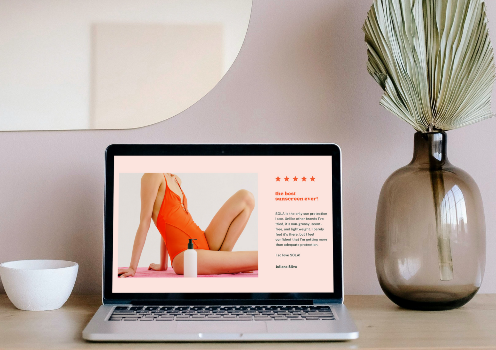
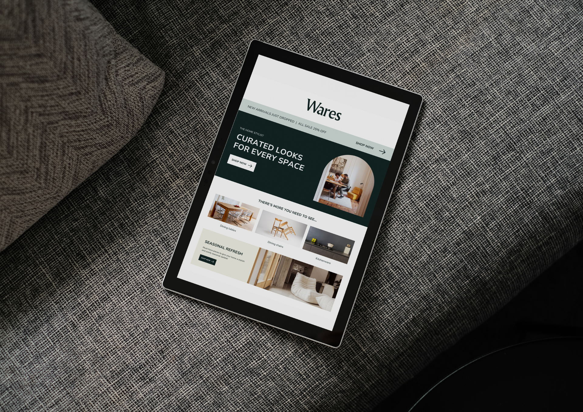
At Web Design Sheffield, we pride ourselves on delivering top-notch web design services tailored to your needs. Whether you opt for responsive or adaptive design, our experienced website designers and developers will ensure your website is visually appealing and highly functional. Choose us for a professional, personalised approach to web design that sets your business apart.
Check out our latest GBP update about choosing between responsive and adaptive
website design.